There are several tried and true methods for creating a website structure. One would be to draw up a diagram using MindMap; tracing user flow is another proven approach.
And yet, mind mapping is not the best tool when designing complex pages: one page may contain several information blocks, and it’s helpful to have all of them before your eyes when developing a project.
Table of Contents
Research and Statistics
A brief analysis of the market shows that around 80% of users utilize mind mapping for creating website structure. This method allows to quickly set up a structure, internal link pages, and even color-code blocks and sections.
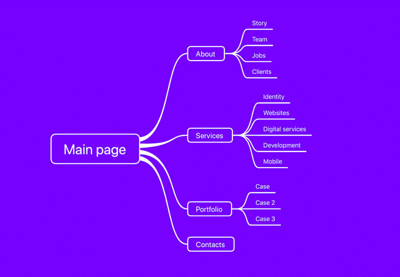
This leaves many users who turn to the alternative method—specialized products created for site prototyping and focusing on visualizing site maps. These tools usually do not allow to display of content blocks within pages. The best they can offer are icons that can be used to organize content but cannot provide a sufficient level of detail to create a visually accessible, informative site map.
“It’s not enough to create a good site map without detailed content blocks for each of the pages.”, Karl Plaude, author of the Content Brick method.
The Content Brick Method
After 18 years in web development, we have developed a new, more straightforward way of creating a website structure. During just one year, the number of users of this method has tripled. It is also engaging and fun and accessible even for newbies.
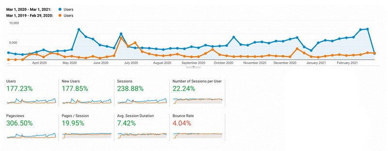
If that’s not enough to convince you, you can always ask Google, where we’re currently in the top 3 queries based on relevant keywords. You’re also welcome to read the hundreds of reviews on Twitter.
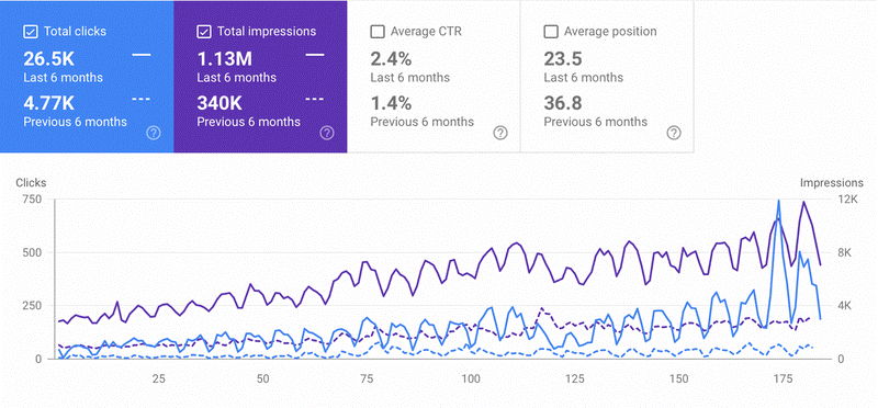
How Did We Manage That
We came up with the Content Brick method in 2016. It has helped us make the process of prototyping website structures much quicker and simpler thanks to its ability to create and organize blocks of content for each page and later combine them within the final structural framework.
So, why don’t we start at the beginning and go over everything in detail.
The Story Behind Content Brick
Even before Octopus, we knew from years of developing websites that the best way to prototype a website structure is using stickers or some other kind of paper stickers. It may sound funny, but that’s how we went about prototyping until 2019 before we developed Octopus. Here’s why paper stickers remained our best friend for so long.
So, you start with a pack of stickers, a marker, and a tabletop on which to layout the stickers. One sticker equals one page. It’s worth noting that websites and post-its share one key common feature: the rectangular shape.
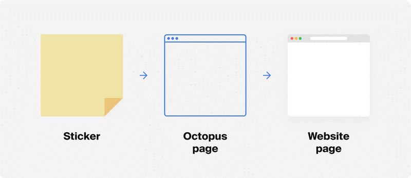
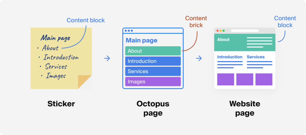
A page can never be empty (even though blank pages do exist): there will always be content on it, be it a text block, image, article introduction, list of services, feedback form, etc. Even the modest ‘error 404’ message is content.
That’s why to visualize each page, on each post-it, we would write up bulleted lists of content blocks. We would call these content bullets ‘bricks’, perhaps because we were building a website. Soon, we called them ‘content blocks’ and ‘content bricks,’ and the latter stuck.
After a few hours’ work, the table would be covered with stickers—the future pages of the website—laid out hierarchically, each sticker containing its page’s list of Content Bricks.
You can say this is visualization taken to the extreme: having all of the Content Bricks right before our eyes allowed us to account for each future page and the links between the pages.
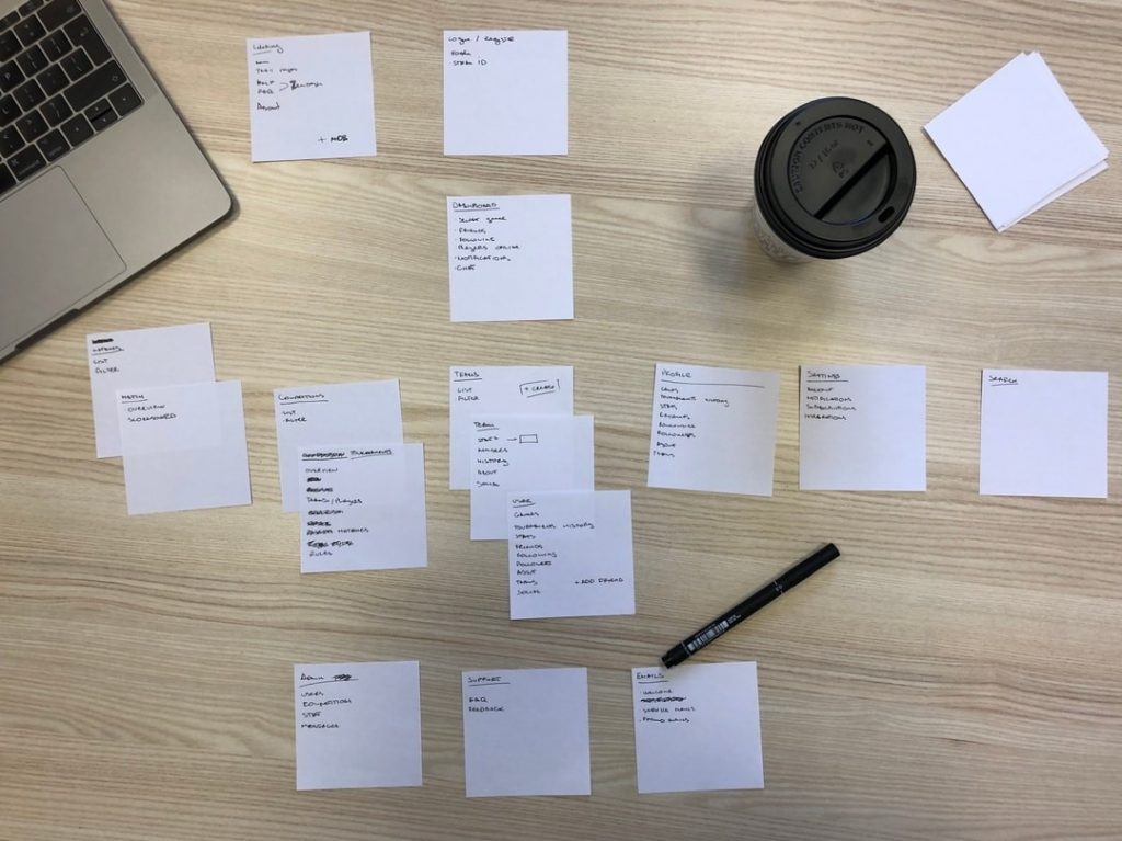
Each sticker represents a website or app page; lists are made up of Content Bricks, allowing to account for each future page and the links between the pages. Feel free to stick to stickers and markers if you like, or you can also use Octopus!
‘Content Brick’ offers several simple steps for you to follow when making up a structure for your website or mobile app.
STEP 1
Mainpage First vs. Structure First
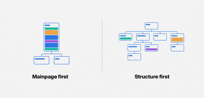
The first thing you need to get out of the way is to decide which approach to the structure will work best for you: Mainpage First or Structure First.
Mainpage First
Just as the name suggests, this approach implies using the main page as the starting point for your structure. First of all, create your main page and use Content Brick to map out the future content of the website.
Here’s an example of what may be on the main page:
- Header
- About
- Introduction
- News
- List of products
- Footer
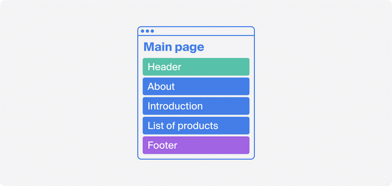
Now you have a great starting point to decide what the following pages should be about. All that’s left is to describe them using the same method and decide on the hierarchy of the pages.
Structure First
This is the approach that we use most of the time. It starts with coming up with all the critical pages at once and then concentrating on each one individually. Say we need to create a corporate website. After quick research of relevant websites, you can decide on a structure that looks suitable:

Now, having a ready-made structure, we can move on to map out content for each page, of course using ‘Content Brick.’
Lifehack
If you don’t want to create a structure from scratch, be it because of time constraints or just laziness, our visual sitemap generator can help! Or you can make use of our site map examples for a ready-made solution.
STEP 2
Visualize Content Blocks
As we have established, each page in a website is made up of blocks of content. But, what is the best way to visualize the future page layout and break it down into graphical blocks? Here’s a quick example.
Imagine a title page that’s made of the following Content Bricks:
- Header
- Sign Up
- About
- Introduction
- Features
- Video
- Images
- Footer
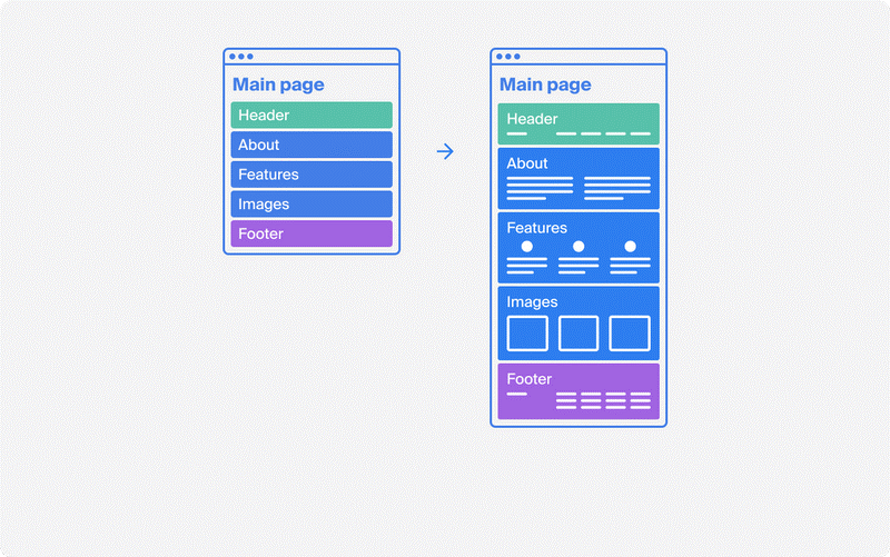
Looks straightforward enough, but even a rudimentary graphic representation will immediately make the image in your mind so much more vivid. This can help everyone involved in the development visualize the content blocks for each page of the website.
Here’s what happens if we add a bit of graphics (wireframes):
Lifehack
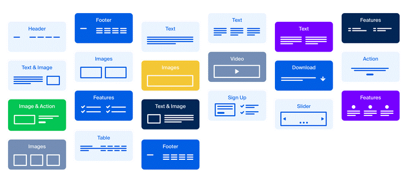
You don’t need to spend too much time thinking which wireframe goes to which content block; we’ve taken care of that for you. There aren’t too many (just 21), but they’re the most widely used. All you need to do is pick the right one for you.
Low Fidelity Wireframe
A low-fidelity wireframe is the most straightforward and fastest visual representation of a future web page or interface. It remotely represents how and what information will be displayed on the screen. It’s similar to a paper sketch.
STEP 3
Bird’s Eye View & Estimate Web Project
We’ve talked about how you can use the ‘Content Brick’ method to create your websites. But it has another good advantage: A bird’s eye view. When you have the entire website structure laid out before you, along with a detailed description of each page’s content blocks, you can see the whole website and appreciate its scope.
No mind mapping tool will offer this advantage. Bird’s eye view can be helpful when determining the number of work hours needed to develop the project, and you can quickly make separate estimates for each stage (design, frontend, development, testing, etc.). Or you can use it to brief your copywriter, who can then start working on the text content since they would already have all the information they need.
Conclusion
‘Content Brick’ is a simple but effective way to create a website structure and map out content. Its main advantage is that you no longer need to be a webmaster guru to create a functional, working website.
Don’t think, however, that it eliminates all of your work! Maybe someday, but not quite yet! The structure will not build itself.

